Charts
Turn a block of cells into a bar, line, area or pie chart that updates with the data.
Turn a block of cells into a bar, line, area or pie chart that updates as the data changes.
Before you start: adding and changing charts needs Can edit on Sheets. Anyone who can open the workbook sees its charts.
Add a chart
- Select the data: labels in the first column (for example customer names), numbers in the next columns. If the first row holds headings, include it — it names each series. Otherwise the column labels are used.
- Click Charts on the toolbar. The charts panel opens on the right.
- Click From selection.
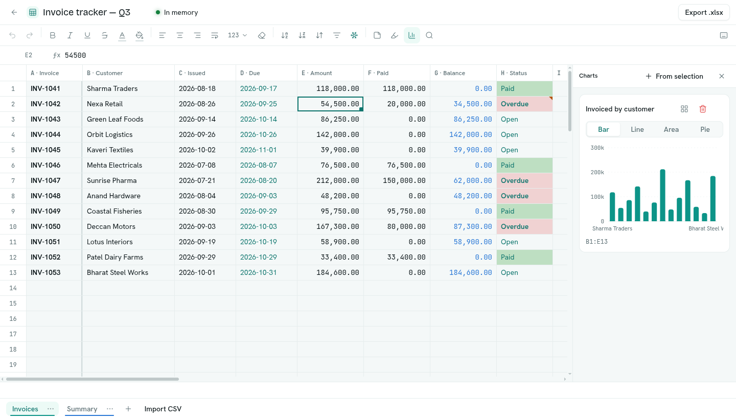
Change a chart
- Switch between Bar, Line, Area and Pie.
- Click the title to rename it.
- Select chart data (the grid button) selects the cells the chart reads, so you can check or extend them.
- The bin deletes the chart (you confirm first).
Charts are saved with the sheet. Edits to the data show up in the chart straight away.
How data becomes a chart
- The first column labels the points. A one-column selection becomes a single series labelled by row number.
- Each other column with numbers is a series. Date columns and columns with no numbers are left out.
- Bar with several series draws one small bar chart per series. Line and Area draw all series on one chart. Pie uses the first series.
- A chart reads the first 200 rows of its range. For bigger data, summarise it first (for example with
SUMIFon another sheet) and chart the summary. - A sheet can have up to 20 charts.