Chart types
Pick the right chart for a report widget — stacked and 100% bars, area, bar + line, funnel, pivot table, gauge and the India state map.
Every report widget can draw its query as a table, a headline number or one of thirteen charts. This page explains what each chart needs from your query, so you can pick the one that answers your question.
Before you start: you need Full control on Analytics & reports to change a report, and a widget with its own query or a saved query.
Choose a chart for a widget
- Open the report and click Edit report.
- On the widget, open its Widget options menu and choose Configure…. The Configure widget window opens.
- In Visualisation, pick the chart. Auto chart picks one from the shape of the result.
- Click Done in the Configure widget window, then Done on the report.
In the query workspace, the Result view switcher above the result shows Table, Bar, Ranked, Line, Donut and Metric; the other charts are under More charts. A chart only appears there when your result has the shape it needs.
What each chart needs
- Line and Area — a date or month column, then a number. Order the rows by date.
- Bar and Horizontal bar (ranking) — a category or period and a number.
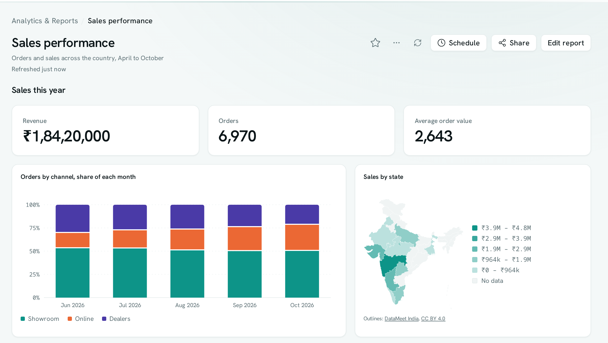
- Stacked bar — the parts that make up each bar. Either a category and two or more number columns (one per part), or three columns: category, part and number (for example month, channel, orders).
- 100% stacked bar — the same data as a stacked bar, shown as each part's share of its bar.
- Stacked area — the same data again, over time.
- Bar + line — a category and two or more number columns. The first is drawn as bars, the others as lines. When the line measures something different — a margin percentage over revenue — it gets its own scale on the right.
- Donut (share) — a category and a number. Up to eight slices are drawn; any more are combined into one "Other" slice.
- Funnel (stages) — a stage and a count, up to 12 stages, in stage order (enquiries, visits, applications, admitted). Next to each stage you see the share that carried on from the stage before, and under the funnel the share that made it from the first stage to the last.
- Pivot table (rows × columns) — two label columns and one number, for example region, quarter and sales. The first label becomes the rows, the second the columns, with row, column and grand totals. Totals are added up exactly, to the last paisa.
- Gauge (progress to target) — one row with a value and a column named
target(orgoal). The dial shows how far the value is towards the target. A single percentage column works too. - India map (by state) — a state and a number. The state can be its name (Maharashtra), its two-letter code (MH), its GST state code (27) or a full GSTIN. Darker states have more; states with no rows are shown as "No data".
Good to know
- A chart only appears when the result has the shape it needs, and for results of up to 100 rows.
- If the result doesn't have the shape a chart needs, the widget falls back to the chart that fits.
- Stacked charts show up to eight parts. Any more are combined into one "Other" part.
- Negative values are drawn as zero in stacked bars and on the map. Use a table to see them.
- Rows on the India map that don't name a state are listed under the map, so nothing goes missing.
- Very small territories (such as Lakshadweep) are hard to see on the map. Hover over the map or switch the widget to a table to read every number.
- Right-click a widget (or use its menu) and choose Download CSV. Charts can also be saved as a picture with Download PNG. Pivot tables are tables, so they download as CSV only.
- India map outlines: DataMeet India community, CC BY 4.0.